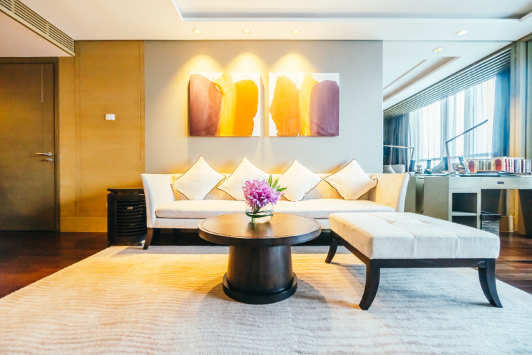
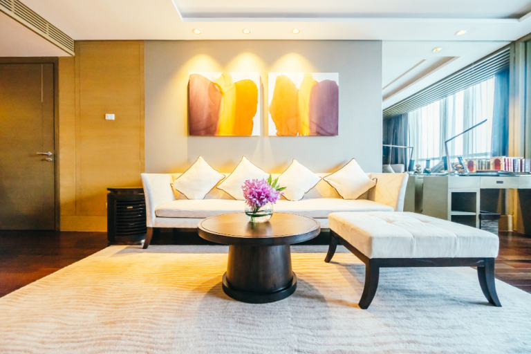
Colour is the most powerful and most misunderstood tool in interior design. A single paint decision — the colour of the wall behind the sofa — changes the entire character of a living room: its warmth, its energy, its apparent size, and how every other element in the room reads against it. In Bangladesh, colour decisions are further complicated by a specific variable that temperate-climate design guidance does not address: tropical light. Understanding how Bangladesh’s intense, warm sunlight affects colour perception — and choosing palettes that work with that light rather than against it — is the foundation of confident colour design. This complete guide covers colour schemes for interior design in Bangladesh across every major context.

How Tropical Light Changes Everything
Bangladesh receives some of the most intense and warm-toned natural light in the world — particularly in the dry season (October–March) when clear skies allow full solar intensity. This light has a significant impact on interior colour perception:
- Warm colours read warmer: Ochre, terracotta, rust, and warm whites that might appear balanced in northern European light read very warm — even hot — in strong Bangladesh sun. In rooms with direct south or west sun exposure, these tones may need to be used as accents rather than primary wall colours.
- Cool colours appear more balanced: Colours that read as cold in northern Europe — cool greys, blue-greens, sage — often appear pleasantly refreshing and balanced in Bangladesh’s warm light. They perform better in this climate than conventional wisdom might suggest.
- Saturation is amplified: Saturated colours — deep forest green, rich navy, strong terracotta — appear more intense in strong light. What reads as a confident, sophisticated colour in a shaded test patch can be overwhelming on a full wall in direct sun. Always test paint colours in the actual room at the actual time of day when the light is most intense.
- Artificial lighting dominates in the evening: With heavy curtains drawn in the evening and artificial warm lighting, the colour calculation shifts entirely from daylight performance to artificial light performance. A colour that looks right under tungsten or warm LED may be completely different to how it appeared in daylight. Test always in both conditions.
Colour Palettes by Space Type
Living Room Palettes
Warm Neutral (most versatile): Warm white (not pure white — add a touch of cream or yellow), complemented by natural timber tones and linen textiles. Works in all light conditions, ages gracefully, and serves as a platform for seasonal accessory changes. The safe choice that nonetheless produces beautiful results when executed with quality materials.
Warm Earthy (currently the most popular premium choice): Warm greige or pale sand primary wall colour, one feature wall in terracotta, ochre, or deep rust, complemented by rattan, timber, and olive green soft furnishings. Particularly effective in apartments with good natural light where the warm colours are balanced by daylight. Feels contemporary, warm, and distinctive.
Forest Green (rising trend): Deep forest green on one or two walls, complemented by natural timber, brass or gold hardware, cream upholstery, and warm white on remaining walls. Creates a rich, grounded atmosphere that is particularly effective in evening use under warm lighting. Bold but sophisticated — requires confidence to commit but rewards that commitment.
Bedroom Palettes
Bedrooms benefit from the calming end of the palette — colours that lower stimulation and support sleep. Soft sage green (associated with nature and calm), warm blue-grey (cool without being cold), deep charcoal (enveloping and cocoon-like in a bedroom context), and warm plaster pink (feminine without being sweet) all work well in Bangladesh bedrooms. Avoid stimulating, high-energy colours (bright orange, vivid yellow, intense red) as primary bedroom wall colours — they work against the room’s purpose.
Office and Commercial Palettes
Corporate offices: predominantly white or very pale neutral primary walls with brand colour accents on feature walls, reception backgrounds, and joinery. The white base communicates professionalism and clarity; the brand colour communicates identity. Avoid primary palettes dominated by saturated colour — they can be energising in small doses and exhausting in large ones, particularly in tropical light.
Creative offices and F&B environments: more latitude for bold colour. Forest green, deep teal, warm terracotta, navy blue, and rich burgundy all work well in commercial environments where atmosphere is a design goal rather than a background condition. The key is committing fully — a half-hearted application of a bold colour reads as an accident rather than a decision.
Restaurant and Cafe Palettes
Restaurant colour works hardest at night, under artificial warm lighting — the conditions in which most revenue is generated. Deep, rich colours (forest green, burgundy, navy, deep charcoal) absorb the warm artificial light and create intimate, enveloping atmospheres that keep diners comfortable for extended periods. Pale colours and whites look fresh in the daytime but can feel cold and cafeteria-like in the evening unless the lighting design is exceptional. For restaurants that trade significantly in the evening, bias the palette toward the darker, richer end of the spectrum.
How to Test and Choose Colour Confidently
- Paint large test patches: A small paint swatch is nearly useless. Paint a minimum 500×500mm patch on the actual wall and observe it for at least 24 hours across different lighting conditions — morning, midday, afternoon sun, evening artificial light.
- Test adjacent colours together: Colours only exist in relationship to each other. Test the wall colour adjacent to the planned flooring, furniture, and joinery samples simultaneously.
- Observe at the actual time of use: A bedroom colour should be assessed under evening artificial lighting (when it matters most for sleep); a restaurant colour should be assessed under the planned dining lighting at dinner service intensity.
- Commit fully: The most common colour mistake is under-committing — choosing a colour that is too close to white to read as a decision. A colour needs sufficient saturation to have presence; a colour that is almost white reads as dirty white rather than a pale tone.
Related: Interior Design Styles Guide | Interior Design Trends 2025 | Living Room Design Dhaka | Master Bedroom Design | Restaurant Interior Design Guide
Choosing colour for your home or office in Bangladesh? Contact House De Arch — we help you commit to colour with confidence.