The Holy Crab is one of Dhaka’s most energetic and visually distinctive seafood restaurants — a Gulshan destination that turns eating crab into an event. House De Arch was commissioned to design the complete interior from entrance facade to every surface, fixture, and graphic element inside. The result is a bold, immersive environment built around one idea — that eating seafood should be fun, social, and completely unforgettable.
Project Overview
| Detail | Information |
|---|---|
| Client | The Holy Crab Restaurant, Dhaka |
| Cuisine | Seafood — Louisiana-style crab, lobster and shellfish |
| Location | Gulshan, Dhaka |
| Capacity | ~80–100 covers across main dining and banquette zones |
| Design Style | Industrial-coastal casual dining |
| Scope | Full interior design — concept, materials, graphics, lighting, FF&E, entry facade |
| Delivery | House De Arch integrated design and fit-out |
The Brief: Design an Experience, Not Just a Restaurant
The ownership team had a clear vision: the interior should be as much of the story as the food. Louisiana-style seafood dining — communal, hands-on, gloriously messy — demands a space with personality and energy. The design had to communicate the brand’s coastal-casual identity the moment a customer saw the entrance, carry that identity through every wall and fixture inside, and create an atmosphere people want to photograph, share, and return to. It also had to work efficiently for high-volume seafood service across a mix of group sizes.
Design Concept: Industrial Coastal
The concept draws on the visual language of the American Gulf Coast — weathered timber fishing docks, painted corrugated boatsheds, raw industrial seafood processing facilities, and the unpretentious pleasure of eating great shellfish in good company. In Gulshan, this became a rich layering of industrial and coastal materials, bold brand graphics, and a colour palette anchored by signature red, warmed by teal, and grounded in exposed brick and reclaimed timber.
The design deliberately avoids the formal luxury aesthetic common in Dhaka’s premium dining scene. Instead it creates a space that feels authentic, playful, and full of character — a restaurant where you can arrive in a group, roll up your sleeves, crack some crab, and feel completely at ease. The interior communicates that message from the entrance facade to the back wall.
The Entrance: Brand Identity Visible from the Street
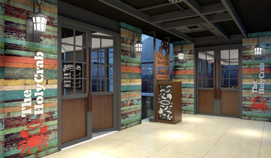
The entry corridor is clad entirely in multi-coloured reclaimed timber planks in a deliberately weathered palette — aqua, burnt orange, deep red, and dark timber — evoking the painted wooden structures of a Gulf Coast fishing port. Traditional coach lanterns on the timber columns provide warm, welcoming light. French-panelled walnut-tone doors open into the restaurant, flanking a branded host stand with seafood motifs carved into the panel. The Holy Crab logo in bold white script against the coloured timber is visible from the street — unmistakably the brand, impossible to miss.
The Dining Room: Materials, Surfaces and Spatial Environment
Inside, the design is built around the productive tension between industrial rawness and coastal warmth. The ceiling is painted deep charcoal black with all services — ductwork, conduit, HVAC cassettes — left fully exposed and painted out dark. This makes the room feel taller while adding honest industrial texture and letting the dramatic lighting take centre stage.
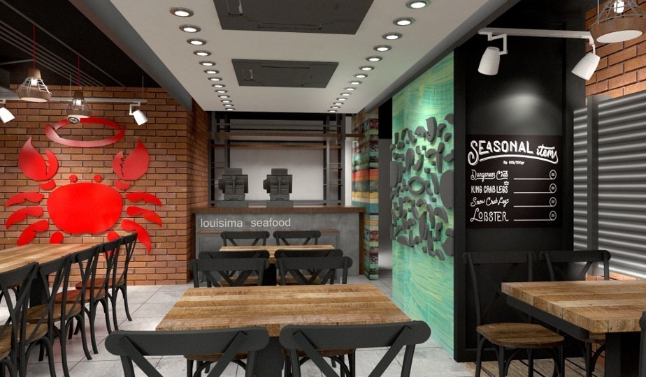
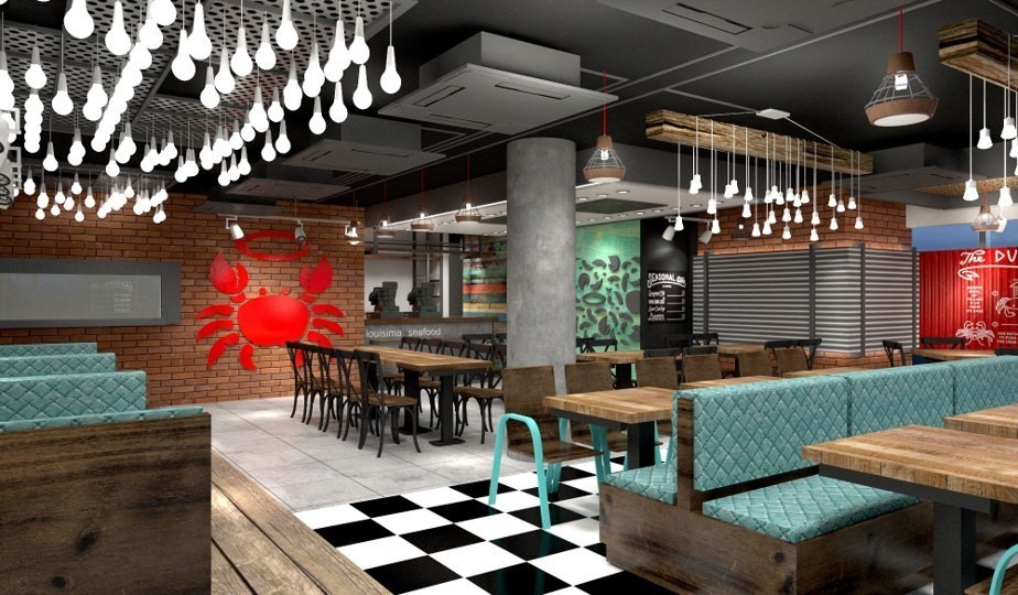
The walls deliver the material contrasts that define the space. Exposed warm terracotta brick on the kitchen-facing wall forms the backdrop for the restaurant’s most striking graphic element — a large-scale red crab sculpture, laser-cut from steel and powder-coated in the brand’s signature red, mounted directly onto the brick. A corrugated galvanised steel panel zone on a secondary wall adds harbour-district texture. A vibrant teal mural wall with an abstract deep-ocean seafood pattern completes the palette. Each wall has a distinct material language; together they wrap the dining room in a continuous coastal-industrial narrative.
The Brand Graphic Wall: Environmental Storytelling in Red and White
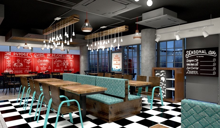
The “Dummies’ Guide to De-Shelling” — a full-height, full-width graphic panel in the brand’s vivid red, covered in hand-lettered instructions, illustrations, and seafood facts rendered in chalk-white script — is the most photographed element of the entire interior. It combines practical information (how to crack a crab, what each species tastes like, techniques for extracting lobster meat) with playful typography referencing vintage harbour signage and American roadside graphics.
This single graphic element does more for the brand than almost any other design decision. It is instantly recognisable, endlessly engaging, and functions simultaneously as interior art, brand communication, and social media backdrop. Adjacent, a chalk-style “Seasonal Items” menu board in black and white completes the composition — rotating content that keeps the wall fresh across service periods and seasons.
Flooring: The Checkerboard Statement
The main dining zone is floored in large-format black-and-white checkerboard tiles — bold, graphic, and immediately energising. The pattern references the classic American diner aesthetic, connecting The Holy Crab’s Louisiana culinary roots to a visual language that resonates across cultures and generations. It creates strong directional rhythm through the space, frames the reclaimed timber tables and teal chairs above it, and makes every photograph taken in the restaurant visually coherent — the graphic floor unifies all the foreground elements into a single composition.
Where flooring transitions to the service counter zone, large-format neutral porcelain tile provides a practical, easy-clean surface that contrasts with the graphic boldness of the dining area without disrupting the overall aesthetic flow.
Lighting: Industrial Drama at Every Table
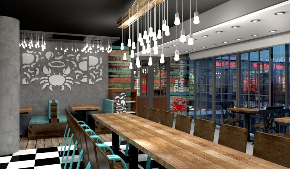
The lighting design is the most theatrical element of the project. The centrepiece — and the most photographed feature after the red mural wall — is a series of cascading Edison bulb installations: dozens of bare filament bulbs suspended at varying heights from reclaimed timber ceiling frames, creating a glowing overhead canopy across the main dining zone. The visual effect is simultaneously industrial and festive — evoking the strung lights of an outdoor seafood market while delivering warmly intimate table-level illumination.
Individual wire-cage pendant lights in copper and black tone supplement the cascading clusters over secondary seating zones. Recessed LED downlights serve the service counter and kitchen-facing areas. Track-mounted spotlights illuminate the brand artwork and brick walls, ensuring the graphic installations read clearly at all light levels. All fittings are in the 2,700–3,000K warm range, maintaining the cosy, energetic atmosphere from the first lunchtime cover to the last evening sitting.
Seating: Communal, Flexible and Character-Rich
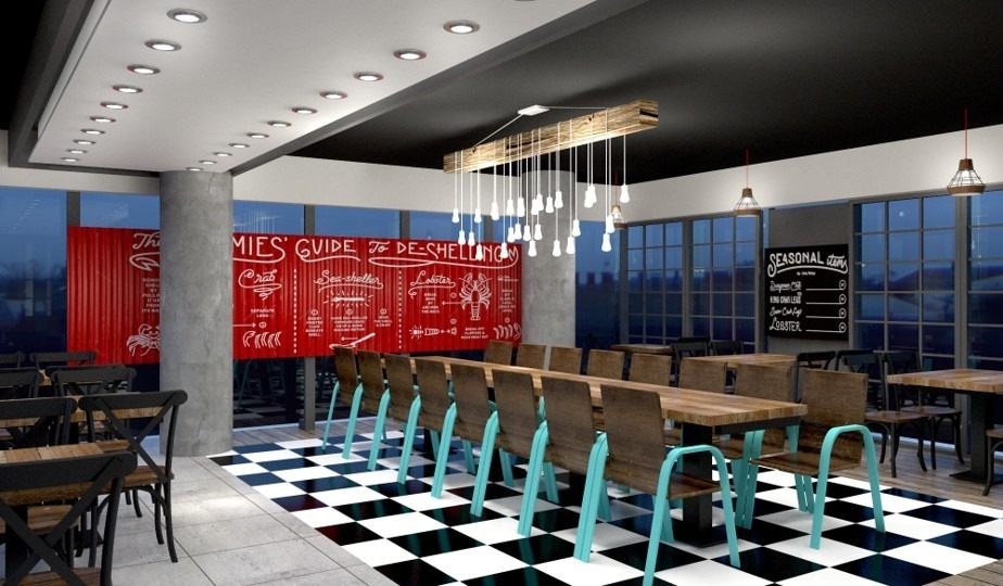
The seating strategy is designed around the communal nature of seafood dining. The Holy Crab serves a cuisine that is inherently social — buckets of crab shared across a table, bibs tied around necks, everyone’s hands involved. Large reclaimed timber communal tables accommodate groups; fixed teal banquette booths along the walls serve couples and smaller parties; a loose arrangement of individual timber-and-teal-chair tables provides flexible capacity for service management.
The banquettes are upholstered in deep teal diamond-quilted commercial vinyl — referencing both coastal boat cushioning and classic American diner booth seating, while being fully wipe-clean for a seafood service environment. Built into reclaimed timber box frames, they anchor the otherwise open-plan space into defined social territories. The teal powder-coated metal café chairs are lightweight, visually cohesive with the banquettes, and robust enough for daily high-volume use.
Environmental Storytelling: Every Surface Speaks
What distinguishes The Holy Crab’s interior from most restaurant designs in Dhaka is the depth of environmental storytelling. Every surface has been considered as part of a continuous narrative about seafood, the coast, and the pleasure of eating well in good company.
The laser-cut seafood motif wall panel — crabs, lobsters, prawns, and shellfish in an abstract repeat pattern — turns a raw concrete column wall into a piece of art. The corrugated steel panels evoke the material reality of a working harbour. The chalk-style menu boards reference the handwritten specials boards of a seaside fish market. The red crab sculpture is not decoration — it is a brand icon, a room landmark, a point of orientation and pride. The coloured reclaimed timber entrance corridor does not just look interesting; it transports you the moment you step inside.
Together, these elements do not merely decorate the restaurant. They tell its story. And that story is visible in every customer photo, every social post, every review — the interior is doing marketing work continuously, at no additional cost.
Materials and Durability
Reclaimed and recycled materials feature prominently throughout — valued for their aesthetic authenticity and reduced environmental footprint. Tabletops, banquette frames, ceiling installations, and entry cladding all use reclaimed or sustainably sourced timber with a naturally distressed finish, avoiding chemical staining while achieving the authentic aged quality the design requires.
Exposed concrete columns and the ceiling are left untreated — no cladding, no unnecessary material application. The brick walls are original to the building, cleaned and sealed in place. This material honesty reduces construction waste, lowers the embodied carbon of the fit-out, and produces the authentic industrial quality that applied finishes cannot replicate.
Seafood restaurants are among the most demanding environments for materials — salt, citrus, moisture, and intensive cleaning are daily realities. Every specification was evaluated for durability: the checkerboard porcelain is sealed and impervious; banquette upholstery is commercial-grade wipe-clean vinyl; tabletops are solid timber with a durable lacquer finish; the steel crab sculpture is powder-coated for corrosion resistance. The result is a space that looks extraordinary and cleans down in under an hour after each service.
Design Challenges and Solutions
Acoustics in a Hard-Surface Environment
The combination of hard flooring, exposed brick, concrete, and glass created significant reverberation risk — particularly in a venue where groups crack shells and generally make joyful noise. The solution was integrated into the design: teal upholstered banquettes add substantial soft surface area; the reclaimed timber ceiling installations break up the flat reflective ceiling plane and diffuse sound; the multi-layered graphic walls with their dimensional surfaces all contribute to sound absorption — with no visible acoustic panels anywhere in the space.
Brand Consistency Across Multiple Zones
With such a strong visual identity, the risk was different zones feeling disconnected — each feature competing rather than contributing to a coherent whole. The solution was a strict material and colour hierarchy: reclaimed timber, teal, and red as primary palette; black, concrete, and exposed brick as neutral ground; white and ochre as graphic accents only. Every decision was evaluated against this hierarchy. The result is a space with enormous visual richness that reads as completely unified.
Outcome
The Holy Crab opened to immediate popular success and established itself quickly as one of Dhaka’s most talked-about restaurant interiors. Social media engagement — driven almost entirely by customer photography of the space — contributed significantly to its early profile. The brand graphic wall alone has appeared in hundreds of Instagram posts, creating continuous organic reach at no additional marketing cost.
The space works as hard operationally as it looks: seating mix, material durability, and kitchen flow have all performed well across sustained high-volume service. The design accommodates lunch groups, evening couples, and large private bookings equally well within the same environment.
“House De Arch understood exactly what we were trying to build — a restaurant with real personality, not just a pretty room. Every detail they designed tells our story. Customers walk in and they immediately get it: this is The Holy Crab, and they’re going to have a great time.”
— Owner, The Holy Crab Restaurant
Key Design Lessons from This Project
- Environmental storytelling is your best marketing tool: When every surface reinforces the brand narrative, the restaurant markets itself continuously through customer content.
- Industrial materials require as much design skill as luxury ones: Brick, concrete, reclaimed timber, and exposed steel require precise detailing and careful combination — the sophistication is in the judgement, not the price tag.
- A bold palette needs a strict hierarchy: The Holy Crab uses a limited material and colour system applied with great confidence. The boldness works because it is controlled.
- Durability and beauty are not competing objectives: Every material in this restaurant was specified to look extraordinary and last under commercial conditions. Both requirements were resolved at specification stage.
- Design the lighting as carefully as the materials: The cascading Edison bulb installations are as defining as the walls and the floor. Great restaurant lighting is always designed, never selected from a catalogue.
Related: Complete Restaurant Interior Design Guide | Restaurant Design Trends 2025 | Cafe Interior Design Dhaka | Fine Dining Restaurant Design | BayerCropScience Office Case Study
Have a restaurant project in mind? Contact House De Arch — we design restaurants people remember, return to, and share.